Wednesday 9 December 2009

Pre Budget Report


Fine work by the Guardian today

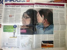
Infographic analysis, a column wide showing UK GDP sector share between 1970 and 2007

For example in 1970 'manufacturing' was 31.7%, whereas two years ago it checkout out at 12.4% of the UK's core money spinner

Apologies for the poor scan, but the graphic is so clear, and well conceived that only a complete numpty can not see the extremely clear, sector comparisons, ahead of Alistair Darlings' final Pre Budget Report

A great piece of work!

Tuesday 8 December 2009

Climate change refugees


The world's first climate change refugees

They are not please with their new-found notoriety, but the inhabitants of the Carteret Islands, after their 300 year history, will be uprooted and evacuated from their homes

The cause: rising sea levels

Where the once white beaches made the island a secret idyll, the highest point now only stands 5ft above sea level

An interactive, by scrolling down the home page by David Kinross, shows this perfectly

The 'Tulin' – people who come from the ocean – and interviewed by the Daily Telegraph, can be seen and heard here on Telegraph.co.uk

Lets hope the world leaders at the summit in Copenhagen can sort their squabbles and deliver

Sunday 22 November 2009

The Leap Year


'Queen bees' making a cottage industry from their writing

Six women writers intend to revolutionise the book trade by publishing from their homes

They have set up an imprint company called Queen Bee Press and their first collection is out now

Called 'The Leap Year' the anthology charts transformational moments in twelve women's lives over the consecutive months of the year. Each story is set in a different country and considers a particular life stage

The six authors of the book, named 'The Contemporary Women Writer's Club' are Miranda Glover, Lucy Cavendish (my wife), Jennie Walmsley, Rachel Jackson, Alexa Hughes Wilson and Anne Tuite-Dalton

They decided to publish themselves because of the problems they saw in traditional publishing. Glover was quoted in the Evening Standard last week saying;
"The industry isn't courting new women's writing... established writers are losing their contracts because they can't compete with Katie Price [the chest, aka Jordan]"
I've read it. I thinks its great. Please take a leap of faith and buy it here

Fighting Taliban control


Strongholds of Hakimullah Mehsud

Please forgive the late posting of this infographic

An important story at the time, four weeks ago, but how the news event developed, or the current status of the Pakistan offensive, is a complete mystery to me

The last report by the Telegraph is here, accompanied with video. After battling since October 17, Pakistani troops gained control of Kotkai, which is the birthplace of Pakistan Taliban leader 'Hakimullah Mehsud', and also the home town of the Taliban's master trainer of suicide bombers 'Qari Hussain'

The latest, according to Al Jazeera and the BBC, is that Pakistani authorities have offered a bounty for information that leads to the capture or killing of Mehsud

Wednesday 18 November 2009

Astute attack submarine


Astute launched into the high seas

Britain's latest £1.2bn submarine was launched this week

It will never need refueling in its 25 year, nuclear life

The Astute, as Thomas Harding writes in the Telegraph, will be able to detect the QE2 cruise liner leaving New York harbour from the English Channel

And obviously great fodder for infographics

Cutaway drawings, maps and simple explosive diagrams, the subject is a dream for infographers

On Monday, also in the Telegraph for the Business section front, Andrew Blenkinsop produced a clean and bold visual package reporting the financial aspects of the Astute project, built and designed by Bae Systems

One story, but many ways and angles to visually report

Friday 13 November 2009

Nuclear Power in the UK


Britain's nuclear future

Another story to my earlier blog on the shooting of UK soldiers in Nad-e-Ali

Here are two infographics, showing the SAME information in a similar way

The Guardian produced clean and clear interactive, with good text narrative per new plant

The Daily Telegraph, above, shows sites where the new plants will be built, sites currently in use and those which have been shut down

Just as interesting, or more in my opinion, is the chart at the bottom which shows when our current plants will be closed, therefore seriously effecting electricity generation from 2010 onwards, and why Ed Miliband and the government needs to act as soon as possible. But it will be pricey

Although Geoffry Lean in the Telegraph counter argues in his interesting analysis that accompanied the infographic on the page

the most cost-effective policy of all would be to reduce the waste of energy... which would by us time, save us money, and create jobs... but Miliband's department is dragging its feet

Wednesday 11 November 2009

Redesign of The Australian


New grids and visuals with impact

News International's creative maestro Alfredo Trivino, talks about his recent project on YouTube

Trivino's working theory: "trying to create a very organic and flexible design – a content driven design"

Using the colours and tones from Australian art, he approached the new colour palette from the incredibly rich red tones from the earth and the beautiful blues from the skyline of the southern hemisphere

His choice of Times Classic as chief font brings a friendly but authoritative voice to the paper

Trivino has also introduced visuals with impact, by creating real-estate within the page hierarchy and NYT-esq "op-ed" infographics in the opinion and comment section

As with all Alfredo projects, it looks a thing of great beauty, but does not navigate away from the business end of the newspaper industry, and quoted here on theaustralian.com

"When you can deliver high-quality journalism and exclusive content that is very valuable it doesn't matter if you deliver it on broadsheet or on A4 paper," he says. "The future is more positive now than ever because the possibilities are endless."

Visual journalism caviar

Thursday 5 November 2009

Unforseen design problems


London lays host to many great architectural delights

And the super Westminster Bridge is no different, connecting north of the river to the south and positioned beneath the PHALLIC Big Ben

Financed by PRIVATE capital, lotteries and grants, the bridge was designed by the Swiss architect Charles Labelye and was built between 1739-1750

By mid 19th century it was subsiding badly and expensive to MAINTAIN. The current bridge was designed by Thomas Page and opened in 1862

With an overall LENGTH of 252 metres and a 26 metre WIDTH, it is the oldest bridge in central London

UK soldiers killed in Nad-e-Ali


Three versions of one news event

Which infographic right?

I guess we should ask 'how much do I now know'

None seem wrong, although how would we ever know?

Local sources communicate to 'stringers' and provide information for our news desk

At which point does information become interpretation?

It is generally assumed that we infographers should only 'show what we know'

If the 'know' is reported to us as 'fact' then we have to rely on this information

Or contact the source direct

Monday 19 October 2009

Job cuts at the New York Times


Juan Antonio Giner analysis is spot on again

Here is a snippet of Bill Keller's memo to the staff of the New York Times

Let me cut to the chase: We have been told to reduce the newsroom by 100 positions between now and the end of the year.
We hope to accomplish this by offering voluntary buyouts. On Thursday, the Company will be sending buyout offers to everyone in the newsroom. Getting a buyout package does NOT mean we want you to leave. It is simply easier to send the envelopes to everyone. If you think a buyout may be right for you, you have up to 45 days to decide whether you will accept it or not.
As before, if we do not reach 100 positions through buyouts, we will be forced to go to layoffs. I hope that won’t happen, but it might.


Not so long ago, Keller said on further layoffs at the NYT, "The answer is no... No I do not see another round of newsroom staff reductions on the horizon."

Giner's statement on this: MORE CUTS, LESS CHANGE

Read his post @ www.innovationsinnewspapers.com

2012 London Olympic pictograms


The Olympic event icon's were launched last week [image 2]

No easy task, to draw, and to even re-render past pictogram's

Some [image 1] have been design classics in particular the 1972 Munich games, which were produced by Otl Aicher, the German designer

While I am behind the news, I first read about this on the Telegraph website yesterday

Also, Creative Review have some interesting observations, not all good

Designed by SomeOne group, the icons work quite nicely when viewed huge - like all bad design

Although we must applaud the attempt to create 'dimension' by introducing perspective (something I have not noticed in previous Olympics) most are rendered 'flat'

The resulting package is one of inconsistency, and a catastrophe for all decent London-based designers

They look worse when produced 20mm x 20mm, the size they most likely will appear in print

Unfortunately we have to live with these design 'bum-notes' for the next few years

And worse than the London2012 logo itself, unbelievable

Monday 12 October 2009

Catching the infographic bug


The Independent on Sunday is at it again

Infographics that are fun by Cath Levett and Richard Burgess

A light news story that lends itself to visual reporting

A huge thanks to Ciaran Hughes for sending this quality work

He says:
Great design, layout, integration of image into graphic. Looks effortless. It has it all!

Wednesday 7 October 2009

Graphic View


Nice job from the Times

Labeled 'Graphic View' in the folio across the top of the page, the infographic is accompanied by a 300 word piece, on a single 'Opinion' page, left hand side

It is a breakthrough of sorts

An editorial decision by the Times to inform their readers with a package of well researched textual and visual narratives

The Times' prolific graphics department is headed by Geoff Sims

Bold editorial thinking

Boner!

Tuesday 15 September 2009

EU interactive


Eurostats are go

Following the Telegraph EU series I mentioned earlier David Kinross has developed our online data monster

All countries are clickable and offer comparisons with various valuable data

A visual database or sorts

Check it out and fill your boots

Roman centrepiece


Bloody hell

More infographia by the inglés conquistadors

This jolly centrepiece from Richard Burgess at the Independent on Sunday

Printed on the 13 September, its got the lot

Illustration, diagrams, maps, photo, cut-outs, film grabs and a timeline

Again, why read the report when you can enjoy the infographic

Beautiful tones, sympathetic to one another

My only note is that typographically, it is flat

No size or weight dynamic

But still its a joy to hold and read

And fantastic piece of work

Infographic caviar!

Speaking my language


Who speaks what across the EU

In the second day of the Telegraph's 'State of Europe' series, we've addressed this issue;

Apparently french is the numero uno language for the EU-27

Well that is just a load of tosh

Clearly, on 51%, the spreche of Rooney, Thatcher and Grimwade is first

And amazingly the EU Commission spent 100m euros interpreting 23 official patois in 2005

The things you now know!

Sexism in the city


Cracking graphic by the Guardian today

Pay equality among executives, male and female

Which shows that only five top women executives earn more than the average of all male executives in the FTSE100

The Guardian have ironed out the problem of 'width disparity' of the spiral increments, which received a few words of caution in the industry

But I think this is very clear, and the colour fab

Why read the piece when you can understand the reporting in the infographic

My only concern is that part of the scale in white was printed in the gutter

Bummer!

Monday 14 September 2009

A new Review


A new family member for the Daily Telegraph designed by Himesh Patel

Launched on Saturday, a well designed supplement

Biased, yes, of course, but a thing of great beauty all the same

Bringing together arts, film, books, stage, music and tv listings, it is a super section

Clean and crisp typography, the font 'Newface'

Saturday 12 September 2009

The last Aztec


A great pullout section in today's Sunday Telegraph

And a great infographic detailing the fall of the Aztecs

Stefan Bayley and Ciaran Hughes have produced an interesting account of the Aztec empire, and the what and the how's

As we say, god is in the detail

And this work has mucho

I like this graphic as it tells and shows a profound account of Moctezuma II, and the life and times of rule for the Aztecs under him

There is so much to learn in this graphic

Like National Geographic, and the works from El Correo, we feel a 'visual overview' narrative

Something not really seen enough in the UK press

as a friend and colleague of INNOVATION would and will say... "infographic caviar"

Thursday 10 September 2009

9|11: eight years on...


Superb interactive journalism

Many angles, many takes of footage from the day we won't forget

History.com have produced this wonderful example of a complete editorial package online

Via a 3d rendering of lower Manhattan at 8:45 am (est), we can chose from which angle to watch video footage, taken by the public

We can also read their story and watch the 'film makers' interview - the eye witness

Although the main event marked a notch on the trunk of history, these lives that changed are the real story

Friday 28 August 2009

Arctic Sea: who's the wiser


Newspaper versus magazines

Time magazine produced this wonderful, simple, clean sequential infographic which tells the story of the Russian owned 'Arctic Sea'

Its design-led textures of 45 degree lines

Its pictogram ship and easy to understand design is similar to that of the Independent on Sunday and Guardian stylebooks

I like it

But we have to rely on the words for information. The visual shows us nothing, whereas the words tell us the news

So not really an infographic

At the Telegraph, we opted for the traditional infographic deployment

Photo, map with a 'estimated' route and statistical background

I think it is also and interesting read

But who gets any more or less from either example?

Do we understand more, from these examples, if we 'show' less

Is it best to rely on the 'telling' rather than the 'showing' of the news?

Let us discuss

Monday 24 August 2009

Your 'Galacticos XI'


Drag and drop interactive

Fantastic, fun work by my good friend Chiqui Esteban at lainformacion.com, just click on this link

Real have so much choice, and a huge squad of great players

Have a go and chose your best teamm, which should on paper, win the CL

New media for old media


Visual journalism education come to London!


I think its well worth a visit, if you can

Here are the details

Camp Video Journalism - London

Oct. 26-29, 2009

Master the art of producing video stories over four days of training. Learn the secrets of building a visual story, interviewing and script writing. Course also introduces basic edits and story planning to speed up production time.

Sponsored by Visual Editors and Beamups.com

REGISTRATION DETAILS: http://londonvj.eventbrite.com/

Sunday 9 August 2009

Show don't tell


Two nice jobs over the weekend

The infographic above 'Muslim Europe' tackles the demographic time bomb which is transforming our continent

Europe's low white birth rate, couples with faster multiplying migrants, will change what we fundamentally what we take to mean 'European culture and society'

Although European elites have yet to grapple with the broader issues of race and identity surrounding Muslims and a sound integration policy

On a lighter note and by the same infografista Ciaran Hughes, a wonderful clean and stylish illustration printed in today's Sunday Telegraph

Kwalitee!

Friday 31 July 2009

Oh Lordy


My good friend and colleague Ciaran Hughes at the Telegraph offered a few words on this bad show in the Daily Mirror on Wednesday

This appeared in Wednesday's Daily Mirror, on a double page spread along with a piece about the police investigation into Michael Jackson's last hours, and his doctor's involvement. 
I think, unfortunately, for most journalists of the old school this is exactly what graphics are for. When the default setting of labeled photograph doesn't work (no picture) then the buck is passed to graphics to visualise something that only states the obvious, adds nothing to the story and can end up cheapening the entire process. 
This sort of nonsense occurs at the top end of the market as well - being asked to do a graphic on how Saddam was hung for example. The strangest thing about all this is that while it only takes a second of thought to see how it will play out, it will take a couple of days for the Graphics Desk to make it happen.

Thursday 23 July 2009

Operation Panther's Claw


Infographics traditional style

Like the good old days of war explanations

The comment 'opener' in the Daily Telegraph today showed the how and the whereabouts of latest offensive in Afghanistan

Is it accurate?

We think so!

The interesting debate between 'data' based in infographics and those which recreate the uncertainty of news reporting on deadline

Its great to base everything on fact, which is now why we celebrate the modern phenomenon of data sheets and spreads of statistics

But we should not forget the great pleasure the reader(s) receive from illustrating a sequence or moment in time, however long or short, of an event so far away that there is no way on earth they could never, ever visualise

That is why we do it for them. It's part of our job description

Stef Bayley built most of this for the Sunday Telegraph, unfortunately editorial real estate was gloved in the opposing corner 

Luckily for the Daily, four days later, the story was still breaking news and I decided to run Stefan's research and visual labour in all of its glory

The infographic runs with a comment piece by Allan Mallinson, ex military, which is an interesting account of 'slogans' by Government and MoD. Both very different.

Gordon Brown has not yet labelled this front in Afghanistan as a 'war'

Yet it clearly is. To label its so would mean serious investment

But without the infographic, or the visual, one would never truly appreciate the huge scale of the operation in theatre

It is however, not based on fact or data, but first-hand impression

Is it right or wrong that we can be confident in not only delivering fact and figures, but also recreate and explore means and methods that show the news?

And to take our readers to a place that neither words nor photography can chart?

Just like Peter Sullivan, John Grimwade, Duncan Mill, Jaime Serra, Charles Blow, Juan Velasco and the boys from Bilbao?

Please leave comments and debate on this subject. I feel strongly that although reporting the fact is of huge importance, surely we can also excite and add our impression, as reporters and visual commentators of the news, that our view [as an infografista] counts!

Wednesday 22 July 2009

Swine flu


A timely guide

Its getting serious this SIV, so let us add clarity and calm things slightly

The ill are getting no help from their local surgeries, and are being told to stay away from GP's practice. No comfort to those who are panic stricken and read headline news

What will Government figures show?

Andrew Blenkinsop and David Kinross and produced this clean and simple interactive for Telegraph.co.uk when the original outbreak consumed the world's media

I'm still rather chuffed with it, it does the job and informs

Tuesday 14 July 2009

The blog


Belated scribe

Its been a while since I've had the chance to write, but times have been busy

We've been producing some nice work lately, so I thought why not show and tell

One of the picks of the crop was this, almost, full-page graphic for the Sport section, which was also placed inside the launch issue of the redesigned 'Weekly Telegraph' and now entitled 'The Telegraph' for overseas readers

Interesting that our infographics seems to have a new lease of life with the compact size, compared to the Broadsheet mothership

This example which shows how Wimbledon's Centre Court roof worked and when

The fun element of the project was interviewing the architectural firm who designed the roof

And of course nice to be able to give 'a jolly good show' as we see in the UK

British Dead in Afghanistan

Not to sure what's happened, but this text disappeared

But this nice interactive by David Kinross gives a memorial of sorts to our troops killed in action, which now stands at 186, in Afghanistan

After scrolling down the page, it can be found here on Telegraph.co.uk

Wednesday 24 June 2009

Dying seconds that last forever


Should we be watching?

Cassandra Jardine reports in today's Telegraph that 'images force change' in a fantastic piece in the Comment section, in light of the YouTube footage of the death of Neda Soltan

'The film lasts only 40 seconds, but it is enough to affect world opinion... In years to come, the bloodied face of Neda - already called Angel of Freedom - will be the image that lingers of the Iran uprising, just as the naked napalmed girl running down the the road has come to encapsulate the Vietnam war...'

But these images are our modern version of of religious icons, with the eyes of the victim invariably looking heavenwards for deliverance as martyrs did in old master paintings

A painting does not purport to represent reality, but photographs and films do

Although they can be manipulated, like Robert Capa's faked 'The Fallen Soldier', and the sacked Reuters Middle East Chief photographer for his handling of Adnan Hajj's doctored images of the Israeli bombing of Beirut

The footage of Neda's death certainly has a ring of truth about it, and feels like something we can trust

Generally, however, British media stay clear of such shocking images, but in the YouTube age, this principle is being eroded

Surely the question now 'is this journalism or voyeurism?'

Tuesday 16 June 2009

HMS Poseidon infographics


HMS Poseidon, which sank north of the British naval base Weihai in 1931 following a collision with a Chinese merchant boat, has been in the news lately as China has been accused of secretly salvaging the sunken submarine with the remains of 18 crewmen on board

But look at these pages, the first a fantastic diagrammatic explainer showing what and how the crew could have escaped, of course some did. This was published in the Illustrated London News on July 18

The second from the Daily Herald on Wednesday June 10. The the collision making the front page splash, which included a single column locator map

A colleague Keith Hoggins, pointed these out while he researching the story for the Daily Telegraph

We all remember great illustrations from our childhood

Most based on 'boys toys' and military craft

Almost 80 years these graphics would still be publishable in our press

They are content driven, and in my view 'content' is all, whether visual or the written word

Sunday 7 June 2009

The real front line of journalism


The editor on...

Last week, Amnesty International gave Eyneulla Fatullayev, editor of the Azerbaijan Daily, its special annual award for journalism under threat, in recognition of his efforts to pursue impartial, investigative reporting which holds institutions and governments to account 

As Fatullayev is serving an eight-and-a-half-year sentence, John Mulholland, pictured, and editor of The Observer, accepted the award on behalf of Fatullayev, who is of course, unable to collect it himself


Newspapers face considerable challenges as the global economic collapse robs us of advertising revenues and the emergence of vibrant digital media robs us of readers. There isn't an editor in Britain, Europe or America who hasn't spent considerable time over the last few years wrestling with these issues. It can mean having to consider reductions in marketing spend, slimmer editorial resources and so on.

It sounds difficult, but if you're Eynulla Fatullayev, you'd relish working in a journalistic environment where these were the toughest challenges you faced. Because Fatullayev's problems are of a different order altogether

It puts wrestling with budget cuts into perspective


Since Amnesty first highlighted his case, more than 14,000 people from across the world have written letters of support to Fatullayev. To read more about their campaign of support, go to http://tinyurl.com/mrb5de

Tuesday 2 June 2009

Air accident [3]


Today's print infographics

They do indeed shed some light on this story

These breaking news examples of simplicity and clarity

The Guardian, example 4, is a solid, clear narrative explaining where flight AF447 departed, where it was supposed to arrive, and located where contact was lost with the Airbus

The Telegraph, example 1, shows other details, such as the nationality breakdown of those on the flight, craft details and route information in a very 'graphic' manner, lively and interesting

Although I doubt whether the Airbus landed or that contact was lost over Africa

As yet, nothing has 'rocked my boat', although I have not seen other examples yet, but please, if you come across something interesting, please send them to me

Air accident [2]


Online explanations for the airbus crash

Well not explanations, but visual reporting

I don't know how old these infographics are, but they seem to do the job

But they are distant

They seem to be removed from the location, albeit we do not know where the aircraft came down

Surely the BBC has the better explanation at this point in time, than el Pais in Spain, and O Globo in Brazil. I could not get onto the Le Monde site, I guess over-subscribed

Although there is something simple, but interesting from Chiqui Esteban, the 'new narratives director' of lainformacion.com

But I'd like to know more about the storm

And how frequent are they at this time of year

Where are the diagrams of the dimensions of the craft, compared to other transatlantic carriers? So many questions...

Not pointing my finger, but thinking aloud


Monday 1 June 2009

Air accident

First to the news

Miles O'Brien in NY was one of the first to blog and twitter with excellent news and analysis

OK, time is on the side of those west of the Atlantic Ocean

But we are supposed to be a 24 hour news planet

And here I am, many hours later with my comments, although I am on holiday


But surely we need some great, but small infographic to explain and show what happened

Lets wait and see the press tomorrow, as there is not much online

Thursday 28 May 2009

Building a better place


Two weeks in and the footings are in!

After 6 years of deliberating, works is in progress on my barn

We pulled down the old barn and garage

In their place will be a place to enjoy, relax and play on the Wii

And a place where the children will become teenagers

Handling the work is a quality builder from Macclesfield

'Mick the Mac' is famed for his white shirts

He is never on site without one, and has not worn anything else on site for the thousand years he has been in the trade

As my late father-in-law said 'people should always remember you for something'

Whether it be for having five sugars in you tea, or producing the most finest/shite graphic on the planet

People will remember you

I'm sure people will remember things about me, but waring a white shirt won't be one of them