Wednesday, 31 March 2010

Moscow blasts: UK breaking news maps


Moscow blasts: UK breaking news maps

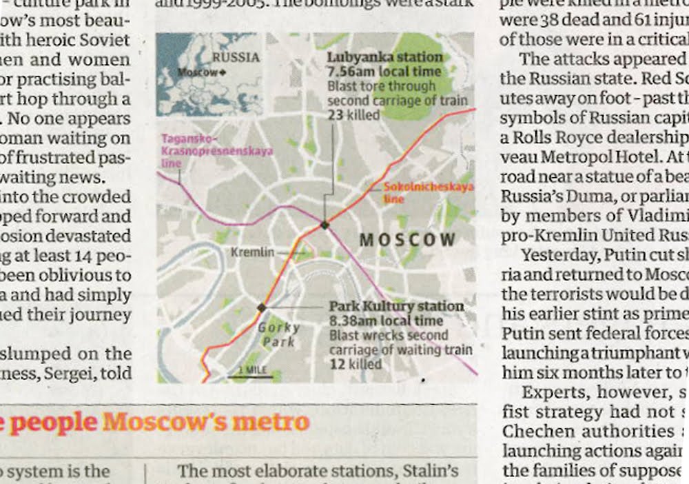
Maps in Tuesday's news sections, yes Foreign news that has made it to the Home news section

Almost beggars belief, here we start with the Times on page 3, and then we have the Independent, the Guardian, the FT and finally the Daily Telegraph with a map/graphic on their Foreign pages

Interesting that the Independent, the Guardian and the FT all have included the Metro lines of geographical importance

The Times chose not to, and like wise we at the Telegraph. Maybe we at the Telegraph should of, but I guess we were too busy explaining other things, that it was another level of information to much

As well as showing a likeness of the Black Widows, we preferred to show where Chechnya is in location to Moscow, keeping with the flow of the story

For other footage and reporting, please click here for BBC News, and an interactive by the NYT here

Monday, 29 March 2010

Guardian mountain of debt


Guardian mountain of debt

More genius from the Guardian

Something which most colleagues pointed out

And they are right, it is great

Look at how the graphic compares the 2009-10 forecast with Alistair Darling's report

The ghost of that past, haunting our future

Click here for the fab journalism

NYT – the art of total journalism


NYT – the art of total journalism

This online report by the New York Times, is possibly, one of the finest of any modern journalism, shows us that the efficiency of footwork is the key to Federer's success

Introduced as a winner in Pamplona, its got the lot

You don't need to be a tennis fan to love this

For me – the best

Voice over from a tennis coach, animation, diagrammatics, video footage and clickable navigation, this project surely points the forward for any media organisation wanting to discover the next level of journalism

It should also be noted, that this reporting could never work on TV as the viewer can control what he/she wants to view, it is visual and so would not work on radio, and because it is animated it leaves print journalism in its slipstream

Although accepted, I recognise that we could extrapolate what we need and produce in illustrator for the print news edition

But this is not the point

This is the power of online journalism, about recognisable forms and people

Visual reporting that transcends infographics

For general society, for the future

Who needs TV when you can watch an iPhone app, or what is new on your iPad?

And a future shaped by infographic editors

Malofiej18 [Rubio display]


Malofiej18 – Rubio display at the opening ceremony and summit hall

A few weeks have passed since the wonderful Malofiej18 world summit at the HQ of infographics in Pamplona, northern Spain

It now feels OK to show this 'rough' video, taken with my iPhone, of a display of Rubio Fernando's work from Diario 16 and mainly ABC

Although the video is not of great quality, and maybe to small, but we can clearly see the raw talent, energy and love that Rubio had for his craft, and his profession

Friday, 26 March 2010

Robin Hood tax


Robin Hood tax for the rich

What do Gordon Brown, Alistair Darling and Robin Hood have in common?

Quite a lot according to the latest number crunchers at the Institute for Fiscal Studies

As we can see from the charts above from the Independent, Financial Times, Guardian, Daily Telegraph and the Daily Mail, all sourced from the IFS, that the three consecutive Labour governments have redistributed our wealth, from the very rich, to the very poor

At the Telegraph, the hardest part of the chart was choosing the right terminology

Transforming data into information, hard wonk speak into words that you and I can understand

He fares best from the above chartery?

Only you can judge... please do

Wednesday, 24 March 2010

FT 'the new Google experience'


FT 'the new Google experience'

There you go

A rather jolly, clean and crisp infographic from the FT

Utterly simple

It works

Monday, 22 March 2010

Malofiej18: Report from the JJ


Malofiej18: John Grimwade reports from the Jumping Jester

Grimwade comments today on the SND website, that you get a very good idea of what is going on in infographic departments around the world, from one bar in Spain - the unofficial HQ of infographics

So, in a somewhat scary atmosphere of smoke and blasts of infographic hot air, you can get a very good idea of what is happening in graphics departments around the world. Not the carefully considered comments you hear in the conference auditorium, but the full-on, uncensored, inside stuff. Of course, drink is a powerful component in this process, but it often just amplifies the underlying truth

So what about the big debate: "Data Visualisation is killing infographics"

No question. This was the hot topic... There is a significant group of graphics people who feel that data-viz graphics do not belong in their newspaper or magazine. “Sterile.” “Impossible to understand.” “Clinical.” “Cold.” These and many more compliments were being banded about. Not opinions shared by all the attendees by any means, but by a large enough group for it to be certainly worth noting

and "are we making graphics for other graphics directors to admire"

Several people felt that perhaps we are. No question, there were tons of lavishly produced mega-graphics in the competition... Some of the attendees had been at the Zeist conference (in the Netherlands), and had heard Charles Blow’s succinct argument that we need to re-evaluate the approach we are taking: Make sure that we have a strong story, worth telling, and tell it in a clear and concise way