Wednesday, 24 June 2009

Dying seconds that last forever


Should we be watching?

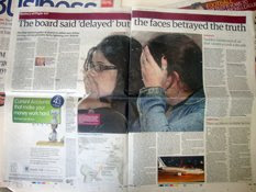
Cassandra Jardine reports in today's Telegraph that 'images force change' in a fantastic piece in the Comment section, in light of the YouTube footage of the death of Neda Soltan

'The film lasts only 40 seconds, but it is enough to affect world opinion... In years to come, the bloodied face of Neda - already called Angel of Freedom - will be the image that lingers of the Iran uprising, just as the naked napalmed girl running down the the road has come to encapsulate the Vietnam war...'

But these images are our modern version of of religious icons, with the eyes of the victim invariably looking heavenwards for deliverance as martyrs did in old master paintings

A painting does not purport to represent reality, but photographs and films do

Although they can be manipulated, like Robert Capa's faked 'The Fallen Soldier', and the sacked Reuters Middle East Chief photographer for his handling of Adnan Hajj's doctored images of the Israeli bombing of Beirut

The footage of Neda's death certainly has a ring of truth about it, and feels like something we can trust

Generally, however, British media stay clear of such shocking images, but in the YouTube age, this principle is being eroded

Surely the question now 'is this journalism or voyeurism?'

Tuesday, 16 June 2009

HMS Poseidon infographics


HMS Poseidon, which sank north of the British naval base Weihai in 1931 following a collision with a Chinese merchant boat, has been in the news lately as China has been accused of secretly salvaging the sunken submarine with the remains of 18 crewmen on board

But look at these pages, the first a fantastic diagrammatic explainer showing what and how the crew could have escaped, of course some did. This was published in the Illustrated London News on July 18

The second from the Daily Herald on Wednesday June 10. The the collision making the front page splash, which included a single column locator map

A colleague Keith Hoggins, pointed these out while he researching the story for the Daily Telegraph

We all remember great illustrations from our childhood

Most based on 'boys toys' and military craft

Almost 80 years these graphics would still be publishable in our press

They are content driven, and in my view 'content' is all, whether visual or the written word

Sunday, 7 June 2009

The real front line of journalism


The editor on...

Last week, Amnesty International gave Eyneulla Fatullayev, editor of the Azerbaijan Daily, its special annual award for journalism under threat, in recognition of his efforts to pursue impartial, investigative reporting which holds institutions and governments to account 

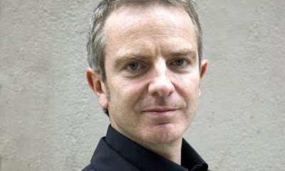
As Fatullayev is serving an eight-and-a-half-year sentence, John Mulholland, pictured, and editor of The Observer, accepted the award on behalf of Fatullayev, who is of course, unable to collect it himself


Newspapers face considerable challenges as the global economic collapse robs us of advertising revenues and the emergence of vibrant digital media robs us of readers. There isn't an editor in Britain, Europe or America who hasn't spent considerable time over the last few years wrestling with these issues. It can mean having to consider reductions in marketing spend, slimmer editorial resources and so on.

It sounds difficult, but if you're Eynulla Fatullayev, you'd relish working in a journalistic environment where these were the toughest challenges you faced. Because Fatullayev's problems are of a different order altogether

It puts wrestling with budget cuts into perspective


Since Amnesty first highlighted his case, more than 14,000 people from across the world have written letters of support to Fatullayev. To read more about their campaign of support, go to http://tinyurl.com/mrb5de

Tuesday, 2 June 2009

Air accident [3]


Today's print infographics

They do indeed shed some light on this story

These breaking news examples of simplicity and clarity

The Guardian, example 4, is a solid, clear narrative explaining where flight AF447 departed, where it was supposed to arrive, and located where contact was lost with the Airbus

The Telegraph, example 1, shows other details, such as the nationality breakdown of those on the flight, craft details and route information in a very 'graphic' manner, lively and interesting

Although I doubt whether the Airbus landed or that contact was lost over Africa

As yet, nothing has 'rocked my boat', although I have not seen other examples yet, but please, if you come across something interesting, please send them to me

Air accident [2]


Online explanations for the airbus crash

Well not explanations, but visual reporting

I don't know how old these infographics are, but they seem to do the job

But they are distant

They seem to be removed from the location, albeit we do not know where the aircraft came down

Surely the BBC has the better explanation at this point in time, than el Pais in Spain, and O Globo in Brazil. I could not get onto the Le Monde site, I guess over-subscribed

Although there is something simple, but interesting from Chiqui Esteban, the 'new narratives director' of lainformacion.com

But I'd like to know more about the storm

And how frequent are they at this time of year

Where are the diagrams of the dimensions of the craft, compared to other transatlantic carriers? So many questions...

Not pointing my finger, but thinking aloud


Monday, 1 June 2009

Air accident

First to the news

Miles O'Brien in NY was one of the first to blog and twitter with excellent news and analysis

OK, time is on the side of those west of the Atlantic Ocean

But we are supposed to be a 24 hour news planet

And here I am, many hours later with my comments, although I am on holiday


But surely we need some great, but small infographic to explain and show what happened

Lets wait and see the press tomorrow, as there is not much online