Showing posts with label independent. Show all posts

Thursday, 8 July 2010

King Carles of Spain


King Carles of Spain ready to rule the world

Spain pay homage to Catalonia (i couldn't resist) with the special "Barca" relationship between Puyol and Xavi

Look at Carles Puyol's eye contact with Xavi Hernandez i Cruz on the back page of today's Independent

Great photojournalism

Xavi supplied the cross from the corner that was met by the skull of Puyol

This moment needs no words – they have playing together as men and boys for Barcelona together for 34 years

How fitting that Vicente del Bosque, the old Real Madrid boss, decided to trust even more in the cult of the Nou Camp and make history for Spain

Ian Chadband for the Telegraph writes a superb homage to the Catalans:

One goal was a paltry reflection of their complete command, even if teams who show some ambition against them – only Chile had previously done so – are liable, like Germany, to be barbecued. For a moment, the fear was that they would not be rewarded, that Germany might snatch victory just as a patient Inter had finally snared Barcelona in the Champions League.

But if the world can see just one more command performance from Spain, if they can bamboozle Holland in the same grand manner on Sunday, and if Van Marwijk doesn’t turn out to be Jose Mourinho, won’t winning the World Cup final sweep away all that Barca angst about losing their Champions League crown?

For by sticking to Barca's glorious principles and showing that, yes, their style can beat the world again, what a triumph for the game that would be. We would then be able to hail the finest champions since the Brazil of 1970

Saturday, 8 May 2010

UK Election infographics


UK Election infographics

Nice clean infographics from the Guardian, Independent, FT and the Daily Telegraph today

And a great proportional representative map from the FT which included constituency names and a label in each corner where a 'swing' had occurred and a colour tab to show from which party

And check out the various online result interactives on the above links

The Guardian has devoted their homepage to infographics

Expect more infographic coverage from the Sunday newspapers tomorrow

Love it!

Thursday, 15 April 2010

General Election leaders' TV debate


General Election leaders' TV debate

Its party time, the 2010 election has finally started, and Nick Clegg has smashed through the "two-party system" in the historic TV debate on ITV tonight

The Telegraph’s verdict

Benedict Brogan says Cameron stayed calm but Clegg got the cream

Janet Daley believes there was no clear winner

And the Telegraph explains that Clegg used the first TV debate to best effect

I agree: Round 1 to the Lib Dems

The Polls
Telegraph: Clegg: 40 per cent, Brown: 16 per cent, Cameron: 44 per cent
Sky: Clegg: 37 per cent, Brown: 32 per cent, Cameron: 31 per cent
ITV: Clegg: 43 per cent, Brown: 20 per cent, Cameron: 26 per cent

All other press is running with the same theme, Guardian, Independent and the Times

Usual press/party bias applies, as expected

Thursday, 8 April 2010

Election erections


Elections erections: its go go time

All the nationals gave it large on Tuesday, massive editorials, mega party-leader pics and huge amounts of infographics

The Times advertised an election map "Free inside" on their masthead

We at the Daily Telegraph produced the UK's favorite election tool – the swingometer – what seats Cameron must win to swing the election in favor of the Conservatives

A huge amount most likely not enough to win an outright majority

Along with swingometers' and general election good election coverage, the Telegraph also interactively helps you how to vote

In the Independent, they produced the last elections results in today's new boundary format

Why?

We are surely used to the Independent producing much more interesting editorial, although one can imagine that most commissioning editors think that the election map of the UK is key to any election...

IT IS NOT

It is a visual lie

For the 2005 election result, while working for the Observer, Cath Levett, Ciaran Hghes and I produced an proportionate example of how the electorate voted (mainly concentrated urban areas in red) and what the constitutional (mainly blue for rural reasons) map compared

The result being a very blue constituency map of the UK, but the majority of votes going to the red of Labour

Please - for any visual reporting for this election, I urge many to look at current graphics from the Guardian, most certainly on Tuesday

It should serve many swell over the next few weeks

Not news based, but excellent and well planned election coverage

The pick of the best being Mark McCormick's online extraveganza

Infographic Caviar indeedy

Wednesday, 31 March 2010

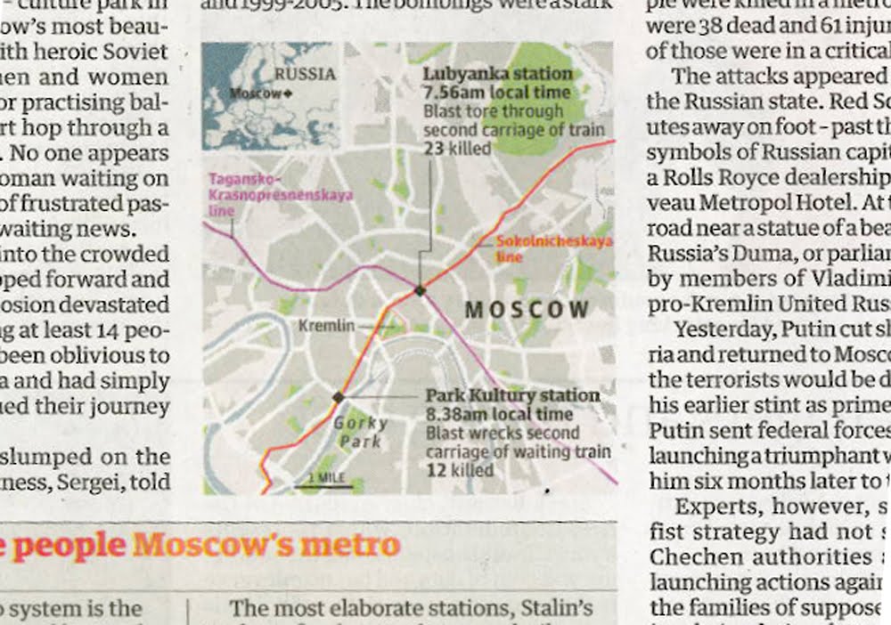
Moscow blasts: UK breaking news maps


Moscow blasts: UK breaking news maps

Maps in Tuesday's news sections, yes Foreign news that has made it to the Home news section

Almost beggars belief, here we start with the Times on page 3, and then we have the Independent, the Guardian, the FT and finally the Daily Telegraph with a map/graphic on their Foreign pages

Interesting that the Independent, the Guardian and the FT all have included the Metro lines of geographical importance

The Times chose not to, and like wise we at the Telegraph. Maybe we at the Telegraph should of, but I guess we were too busy explaining other things, that it was another level of information to much

As well as showing a likeness of the Black Widows, we preferred to show where Chechnya is in location to Moscow, keeping with the flow of the story

For other footage and reporting, please click here for BBC News, and an interactive by the NYT here

Friday, 26 March 2010

Robin Hood tax


Robin Hood tax for the rich

What do Gordon Brown, Alistair Darling and Robin Hood have in common?

Quite a lot according to the latest number crunchers at the Institute for Fiscal Studies

As we can see from the charts above from the Independent, Financial Times, Guardian, Daily Telegraph and the Daily Mail, all sourced from the IFS, that the three consecutive Labour governments have redistributed our wealth, from the very rich, to the very poor

At the Telegraph, the hardest part of the chart was choosing the right terminology

Transforming data into information, hard wonk speak into words that you and I can understand

He fares best from the above chartery?

Only you can judge... please do

Wednesday, 27 January 2010

Emerging from recession?


Emerging from recession?

Britain yesterday officially crawled out from recession, and our glorious media presented the same data in many ways and guises

Which is great

Even in the Daily Telegraph we have to graphics, from the front of the Business section, and the other from inside the main News book, showing differing display methods using the same quarterly GDP data

Squire John Bradley rather smartly compared sector against GDP in the Independent, meanwhile on the front page of the FT, a red line showed GDP historical over a map of Britain

Maybe more information – both visual and textual could have emboldened the FT's graphic

The Guardian produced an incredibly clean looking and impressive global recession map online, and presented their beloved and world-altering circle volume/data display – combining complex data in a fantastically simple manner – nothing new at Michael Robinson's graphical data studio

Lastly at the Telegraph, Andrew Blenkinsop produced a beautiful and dramatic graphic for the front page of the Business section, and Caroline Dewar's 'Timeline of Britain's session' added journalistic value to the News section

All great stuff and cheers!

Thursday, 5 November 2009

UK soldiers killed in Nad-e-Ali


Three versions of one news event

Which infographic right?

I guess we should ask 'how much do I now know'

None seem wrong, although how would we ever know?

Local sources communicate to 'stringers' and provide information for our news desk

At which point does information become interpretation?

It is generally assumed that we infographers should only 'show what we know'

If the 'know' is reported to us as 'fact' then we have to rely on this information

Or contact the source direct

Friday, 1 May 2009

Swine flu: UK press [3]


And there we have it. Day 4

Firstly, lets start with the Times. What the hell (pic 3)? Is anyone supposed to read this? Insane. The Times have produced the greatest of infographics over the past year or so, but this? It's a bio hazard symbol, over a globe, with a load of zero's around it. What kind of editorial decision is this?

Yesterday's heroes, the Independent (pic 1), have finally followed the trend and gone global. Following the hysterical trend of reporting the 'suspected cases', they show where and by what quantity the countries in the spotlight are harbouring their illnesses

The Guardian (pics 4+5) went nuts, over the centre spread, showing the same thing. It feels great. But do we really learn anything new that we don't already know. Similar to the Independent. The global issue was yesterday.

We need to go local. Push the news agenda with infographics. Data maps only get you so far. Why not explain something different? Data is everywhere, on the radio, on TV, on the Internet and all over our newspapers.

So why tell people what they already knew yesterday. OK. This is the life of the printed news. Always playing catch-up. But we should be trying to explain much more...

At the Telegraph (pic 2), not that we are right or wrong, but we decided to develop a different agenda. I had a chat with the online director, who said that users (traffic from Telegraph.co.uk) were not interested in how many cases where around the world, but how it directly involved them.

Basically, what and how the virus was spread, and what happens to the body. So there you are. Our graphic in the Telegraph yesterday. A radically different approach to what the press has covered, but what our readers wanted and needed to know!

Thursday, 23 April 2009

UK Budget [2]


Three's a crowd?

Fantastic - all three competitors of ours - the three other daily 'quality' newspapers in London, the Independent, left, the Guardian, on the right, and centre is the Times

Producing very similar work

All very good, and what matters, is not who's the best, but does the graphic[s] explain the news, and the data in a clear way?

Yes they do

Who developed this technique first, for the Budget, I do not know

Although it wouldn't surprise me that it was the Guardian - they are normally first with something new, and not yet seen

But other quality newspapers are following the Guardian's lead, then what next for the Berliner format newspaper. What different visualisations will they do next year?

Indeed does they need to?

What if the Independent, and the Times develop new ground?

And do something different like what we did at the DT

Not that our coverage was any better - just bigger, and in-depth

But I think we made a good stab at this huge news event

Does it matter that we are seeing a homogenisation of infographics, not only in the UK, but around Europe, and the world?

In Spain - it is difficult to tell from which newspaper what infographic is from where

Is homogenisation good for business?

It certainly makes for a 'strong scene'

I guess it is safe, and secure. We all drink coffee in the morning. We know everyone else is doing it, and therefore we don't stand out. It is confirmation that what we are doing is OK

The world copies the NYT - sometimes very poorly. Only the National Geographic has replicated the NYT – and is doing things better!

We all want to replicate the very best

But where is the creativity?

Where is the innovation?

When we innovate – everyone develops infographic hybrids of the original thought

But to develop this 'thought' – only those who innovate know how to take creativity further
Is innovation dead with the printed format?

I don't think so... the times are too interesting

YESTERDAY was the time to innovated. NOW is the moment to develop