Showing posts with label Daily Telegraph. Show all posts

Monday, 11 October 2010

Chilean miners trapped in San Jose mine [3]


Chilean miners trapped in San Jose mine – online at the Telegraph

Conrad Quilty-Harper
, Data Reporter for Telegraph.co.uk has been updating the content online, and building the graphics

Click here to view the full graphic

Tuesday, 21 September 2010

Telegraph for iPad


Enjoy the best of the Daily and Sunday Telegraph with our new iPad app

The app brings you the editors' selections from our award winning daily newspaper – from the sharpest political reporting to in-depth sports analysis and must-read columnists

The best includes UK news, World news, Sport, Business, Comment, Features and Analysis and award winning cartoonist of the year, Matt

Monday, 13 September 2010

Pope's visit interactives


Pope's visit to the UK

Pope Benedict XVI will visit the UK this week, during which he will beatify Cardinal John Henry Newman, putting him on the Path to sainthood

Two very different interactives from Telegraph.co.uk and the Guardian

Our insightful Telegraph offerings, focus on history of Catholicism and diocese data, where as the Guardian has also excellent background information on Newman and Benedict XVI

Both worthy of perusal and obviously heavily researched

The Catholic Herald and thepaplvisit sites also offer more information

Saturday, 8 May 2010

UK Election infographics


UK Election infographics

Nice clean infographics from the Guardian, Independent, FT and the Daily Telegraph today

And a great proportional representative map from the FT which included constituency names and a label in each corner where a 'swing' had occurred and a colour tab to show from which party

And check out the various online result interactives on the above links

The Guardian has devoted their homepage to infographics

Expect more infographic coverage from the Sunday newspapers tomorrow

Love it!

Thursday, 15 April 2010

General Election leaders' TV debate


General Election leaders' TV debate

Its party time, the 2010 election has finally started, and Nick Clegg has smashed through the "two-party system" in the historic TV debate on ITV tonight

The Telegraph’s verdict

Benedict Brogan says Cameron stayed calm but Clegg got the cream

Janet Daley believes there was no clear winner

And the Telegraph explains that Clegg used the first TV debate to best effect

I agree: Round 1 to the Lib Dems

The Polls
Telegraph: Clegg: 40 per cent, Brown: 16 per cent, Cameron: 44 per cent
Sky: Clegg: 37 per cent, Brown: 32 per cent, Cameron: 31 per cent
ITV: Clegg: 43 per cent, Brown: 20 per cent, Cameron: 26 per cent

All other press is running with the same theme, Guardian, Independent and the Times

Usual press/party bias applies, as expected

Grey London adds colour to BA deal


Grey London adds colour to BA deal

Slightly behind with the news, apologies, but I collected these graphics last week

It is a huge deal, and the Guardian headline to the editorial "British Airways name to vanish from FTSE if Iberia merger succeeds" – slightly summed up the weight of the story

But apart from the two loss making businesses holding each other up, like two drunks trying to find their way home, the use of graphics by the UK press and that of the Spanish, could have not been more different

None are necessarily better or worse pound for pound, content for content, but the offerings by the Guardian and from the Daily Telegraph show that colourful and interesting financial infographics is good business

On one hand we have the basic chart, and in the other multimedia data visualisation

And here, in print, we can see the benefits of both disciplines in very different journalistic strategies

Business is good!

Thursday, 8 April 2010

Election erections


Elections erections: its go go time

All the nationals gave it large on Tuesday, massive editorials, mega party-leader pics and huge amounts of infographics

The Times advertised an election map "Free inside" on their masthead

We at the Daily Telegraph produced the UK's favorite election tool – the swingometer – what seats Cameron must win to swing the election in favor of the Conservatives

A huge amount most likely not enough to win an outright majority

Along with swingometers' and general election good election coverage, the Telegraph also interactively helps you how to vote

In the Independent, they produced the last elections results in today's new boundary format

Why?

We are surely used to the Independent producing much more interesting editorial, although one can imagine that most commissioning editors think that the election map of the UK is key to any election...

IT IS NOT

It is a visual lie

For the 2005 election result, while working for the Observer, Cath Levett, Ciaran Hghes and I produced an proportionate example of how the electorate voted (mainly concentrated urban areas in red) and what the constitutional (mainly blue for rural reasons) map compared

The result being a very blue constituency map of the UK, but the majority of votes going to the red of Labour

Please - for any visual reporting for this election, I urge many to look at current graphics from the Guardian, most certainly on Tuesday

It should serve many swell over the next few weeks

Not news based, but excellent and well planned election coverage

The pick of the best being Mark McCormick's online extraveganza

Infographic Caviar indeedy

Wednesday, 31 March 2010

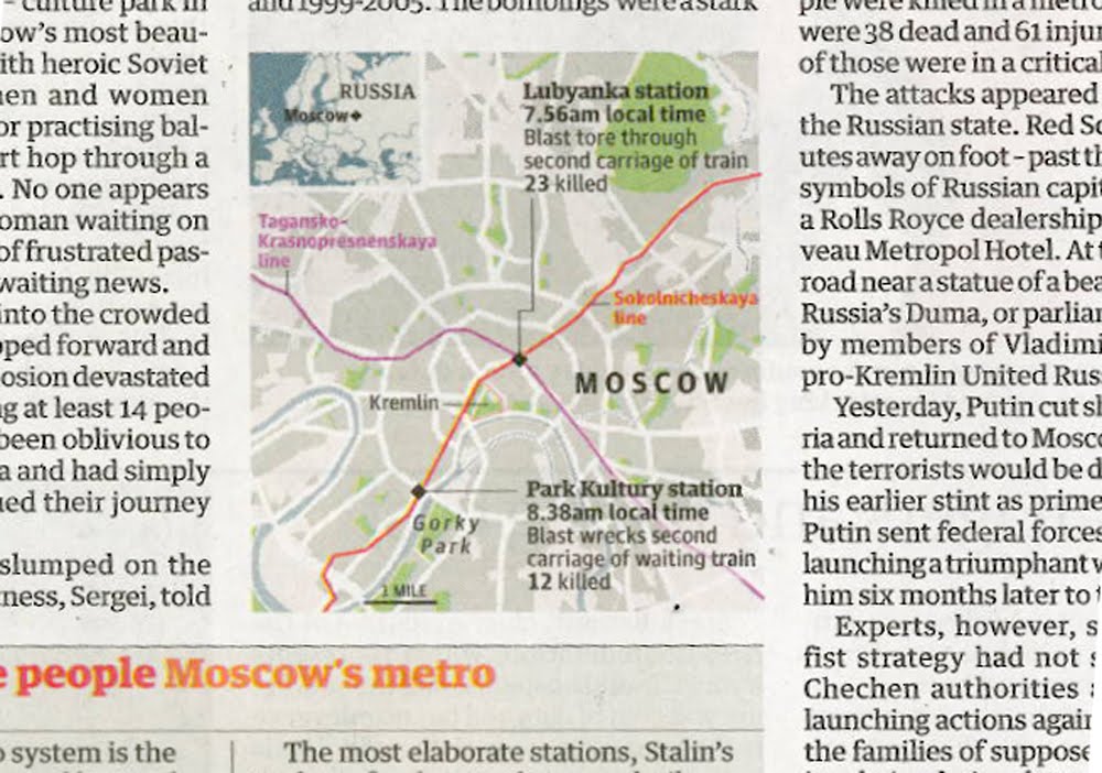
Moscow blasts: UK breaking news maps


Moscow blasts: UK breaking news maps

Maps in Tuesday's news sections, yes Foreign news that has made it to the Home news section

Almost beggars belief, here we start with the Times on page 3, and then we have the Independent, the Guardian, the FT and finally the Daily Telegraph with a map/graphic on their Foreign pages

Interesting that the Independent, the Guardian and the FT all have included the Metro lines of geographical importance

The Times chose not to, and like wise we at the Telegraph. Maybe we at the Telegraph should of, but I guess we were too busy explaining other things, that it was another level of information to much

As well as showing a likeness of the Black Widows, we preferred to show where Chechnya is in location to Moscow, keeping with the flow of the story

For other footage and reporting, please click here for BBC News, and an interactive by the NYT here

Friday, 26 March 2010

Robin Hood tax


Robin Hood tax for the rich

What do Gordon Brown, Alistair Darling and Robin Hood have in common?

Quite a lot according to the latest number crunchers at the Institute for Fiscal Studies

As we can see from the charts above from the Independent, Financial Times, Guardian, Daily Telegraph and the Daily Mail, all sourced from the IFS, that the three consecutive Labour governments have redistributed our wealth, from the very rich, to the very poor

At the Telegraph, the hardest part of the chart was choosing the right terminology

Transforming data into information, hard wonk speak into words that you and I can understand

He fares best from the above chartery?

Only you can judge... please do

Tuesday, 16 March 2010

Animation


Today is the first day of the Cheltenham festival

Like most large racing meets, betting fever takes hold

This is Andy Blenkinsop of the infographics department at the Telegraph

Look how passionately he watches my screen, a screen which is now devoted to horse racing alone

The energy of the horse, and the power of a cash return

On the nose!

Tuesday, 2 March 2010

Future of the NHS


Future of our NHS

In a series of the future of health care this week, the Daily Telegraph has and will look at major parts of how our national health service works, how it compares to other mass employers around the globe and where will the future lie for our state run operation

Coordinated by the mighty Richard Preston, under his editing authors, writers and professors alike have commented and questioned the finance and performance of our primary care trusts

Within the broadsheet format spread, we have included these infographics with should, explain and show our readers how the NHS works, where our cash flows, and what and how much our illnesses cost the Government and us the tax payer

Monday, 8 February 2010

Data Visualisation


Data Visualisation and Quantitative Easing explained by Ciaran Hughes in the Daily Telegraph

The idea, initiated by a infographic which appeared in the Guardian last year

The tried and tested theory of using 'shapes' to 'show' data volume, this example had as many critics in the newsroom as admirers

Maybe the graphic was a little 'modernistic' to explain the story on the front page of the Telegraph's Business section

I disagree

On the left we can see the 'running total' of the value of assets purchased, against the 'monthly total' on the right hand side, keyed at the top of the graphic

I think the reader is able to understand the depth of the financial stimulus package, and when

I love it

Simple, different and colourful

Infographic Caviar!

Friday, 29 January 2010

Daily Telegraph then and now


Daily Telegraph then and now

A little under thirty six years separate these two front pages

The first from August 1974, the second from January 2010

The format then was 394mm x 600mm, and is now 371mm x 575

On clearing out her mother's house, my neighbour found old copies of the DT. This front page happens to present one of the biggest political stories not only in the US, but around the world

Our newspapers have physically changed so much

Colour page one, to colour throughout

Multi-sections and glossy magazines

Photographic reportage, infographics and free DVDs

The only constant over the years has been the need for a strong lead story, like the MPs expenses investigation by the Telegraph

Here are today's front page leads from the quality press in the UK:

The Times: 'Tories plan leadership revolution at the BBC'

Daily Mail: Off-duty police paid £100 to pick up phone'

The Independent: Israeli commander: 'We rewrote the rules of war for Gaza'

The Guardian: Climate chief: I won't say sorry for glacier error


Strong stories sell newspapers

Wednesday, 27 January 2010

Emerging from recession?


Emerging from recession?

Britain yesterday officially crawled out from recession, and our glorious media presented the same data in many ways and guises

Which is great

Even in the Daily Telegraph we have to graphics, from the front of the Business section, and the other from inside the main News book, showing differing display methods using the same quarterly GDP data

Squire John Bradley rather smartly compared sector against GDP in the Independent, meanwhile on the front page of the FT, a red line showed GDP historical over a map of Britain

Maybe more information – both visual and textual could have emboldened the FT's graphic

The Guardian produced an incredibly clean looking and impressive global recession map online, and presented their beloved and world-altering circle volume/data display – combining complex data in a fantastically simple manner – nothing new at Michael Robinson's graphical data studio

Lastly at the Telegraph, Andrew Blenkinsop produced a beautiful and dramatic graphic for the front page of the Business section, and Caroline Dewar's 'Timeline of Britain's session' added journalistic value to the News section

All great stuff and cheers!

Sunday, 17 January 2010

Al-Qaeda fully restructured?


Bin Ladens network cracks on

Always basing themselves where there is trouble and strife, are al-Qaeda back in town?

According to Con Coughlin in the Daily Telegraph:
while intelligence officials say it is impossible to estimate the total number of al-Qaeda activists worldwide, the emergence of Yemen as a major terrorist training and recruitment centre... is now major concern
I'm not doubting this at all, as only before Christmas Umar Farouk Abdulmutallab was discovered on Flight 232 to Detroit, trying to detonate an explosive device near his bollocks

And that Yemen is now an integral part of our fight against terrorism, as our graphic reports

But what trick are we missing, and why is intelligence always two steps behind?

And if I can be stopped at an airport for carrying an almost empty bottle of water, then why can't dozens of angry migrating militants hell-bent on blowing up the innocent?

Tuesday, 8 December 2009

Climate change refugees


The world's first climate change refugees

They are not please with their new-found notoriety, but the inhabitants of the Carteret Islands, after their 300 year history, will be uprooted and evacuated from their homes

The cause: rising sea levels

Where the once white beaches made the island a secret idyll, the highest point now only stands 5ft above sea level

An interactive, by scrolling down the home page by David Kinross, shows this perfectly

The 'Tulin' – people who come from the ocean – and interviewed by the Daily Telegraph, can be seen and heard here on Telegraph.co.uk

Lets hope the world leaders at the summit in Copenhagen can sort their squabbles and deliver

Wednesday, 18 November 2009

Astute attack submarine


Astute launched into the high seas

Britain's latest £1.2bn submarine was launched this week

It will never need refueling in its 25 year, nuclear life

The Astute, as Thomas Harding writes in the Telegraph, will be able to detect the QE2 cruise liner leaving New York harbour from the English Channel

And obviously great fodder for infographics

Cutaway drawings, maps and simple explosive diagrams, the subject is a dream for infographers

On Monday, also in the Telegraph for the Business section front, Andrew Blenkinsop produced a clean and bold visual package reporting the financial aspects of the Astute project, built and designed by Bae Systems

One story, but many ways and angles to visually report

Friday, 13 November 2009

Nuclear Power in the UK


Britain's nuclear future

Another story to my earlier blog on the shooting of UK soldiers in Nad-e-Ali

Here are two infographics, showing the SAME information in a similar way

The Guardian produced clean and clear interactive, with good text narrative per new plant

The Daily Telegraph, above, shows sites where the new plants will be built, sites currently in use and those which have been shut down

Just as interesting, or more in my opinion, is the chart at the bottom which shows when our current plants will be closed, therefore seriously effecting electricity generation from 2010 onwards, and why Ed Miliband and the government needs to act as soon as possible. But it will be pricey

Although Geoffry Lean in the Telegraph counter argues in his interesting analysis that accompanied the infographic on the page

the most cost-effective policy of all would be to reduce the waste of energy... which would by us time, save us money, and create jobs... but Miliband's department is dragging its feet

Thursday, 5 November 2009

UK soldiers killed in Nad-e-Ali


Three versions of one news event

Which infographic right?

I guess we should ask 'how much do I now know'

None seem wrong, although how would we ever know?

Local sources communicate to 'stringers' and provide information for our news desk

At which point does information become interpretation?

It is generally assumed that we infographers should only 'show what we know'

If the 'know' is reported to us as 'fact' then we have to rely on this information

Or contact the source direct

Tuesday, 15 September 2009

Speaking my language


Who speaks what across the EU

In the second day of the Telegraph's 'State of Europe' series, we've addressed this issue;

Apparently french is the numero uno language for the EU-27

Well that is just a load of tosh

Clearly, on 51%, the spreche of Rooney, Thatcher and Grimwade is first

And amazingly the EU Commission spent 100m euros interpreting 23 official patois in 2005

The things you now know!